Revolutionize your digital journey: Where expertise meets innovation
Seize your competitive advantage with a bold mix of strategy, software engineering, AI, and data analytics. We’re not just creating digital platforms; we’re crafting custom, high-impact digital ecosystems that make you more valuable, efficient, and competitive in the digital era.
Our formula blends digital consulting with technical mastery — elevating software, product, and platform development to accelerate business development and growth.
Digital Consulting
Explore new ideas, backed by insights and analytics, to develop actionable plans
5M hours delivering digital products and platforms
98%
98% of projects delivered on time and on budget
2K
2K clients serviced with successful digital solutions
How we do it
Accelerate time to market and maximize cost savings with adaptable partnerships. We flex to the way you work, infusing your team with leadership, industry expertise, and agile-focused skill sets. Our approach helps you pivot to industry shifts and keep your digital products relevant.
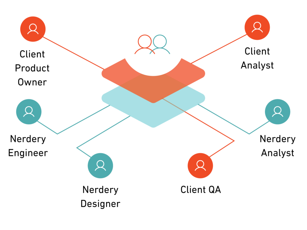
With you: Complement your teams with Nerdery experts
Our goal isn’t to disrupt operations but to enhance them by seamlessly integrating with your team. That’s where adaptable partnership comes into play. Give your team cross-industry expertise, Agile skills, and scalability without changing the way you work.
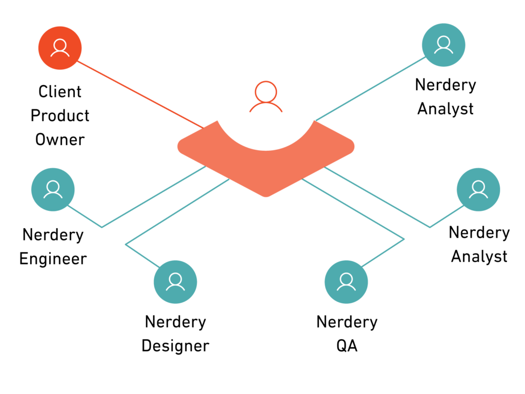
For you: Engage with full-service digital transformation leaders
When you choose our full-service offering, we take your vision and goals and nurture a custom solution from inception to market. With creation, delivery, and optimization services tailor-made for your business case, you can take your digital product to market faster.
Harness the agility and flexibility needed to adapt to an evolving market. We adjust our strategy to you, ensuring our approaches and teams always fit your current trajectory.
Achieve measurable impact at every step
Validate your investment by delivering impact throughout the project — quick wins and steady progress deliver measurable business value at every stage of your journey.
Anticipate what’s next for your industry
With over two decades of proven digital expertise, we empower you with the depth of knowledge to innovate, merging the latest technology with industry best practices.
Companies we innovate with
Digital solutions that fuel growth
Nerdery helps those championing digital innovations to turn their vision into powerful results. We do this by co-developing insights and ideas that help you stay customer-obsessed and keep an outcome-focused mindset throughout each engagement. But don’t take our word for it — dig into the results for yourself.
Curiosity, partnership, and expertise help us identify pain points and co-create digital solutions your customers love. Learn how we use these qualities to spark innovation.